ThrustSEM Logo Design
I was approached by a start-up to create a logo, and choose fonts and colors for the young brand. The design needed to be clean, modern, exciting, and fresh.
Step 1: Logo Design Exploration


The client wanted to lean into the rocket imagery evoked by the idea of thrust. I explored simple shapes that would scale well while still reading as a rocket taking off.
Step 2: Color and Font Exploration
Once an icon was chosen, I began exploring different font and color options. The font needed to feel modern and be easy to read regardless of scale, and be accessible and downloadable. All font options are free web fonts. The colorways were all inspired by flames seen when a rocket takes off.


Deliverable:
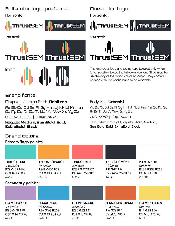
Brand Cheat Sheet and Logo Files
The final deliverables included horizontal and vertical logo variants and icon in full color and one-color options. A brand cheat sheet was also sent to the client as a quick reference as they put together pitch decks and other branded materials.